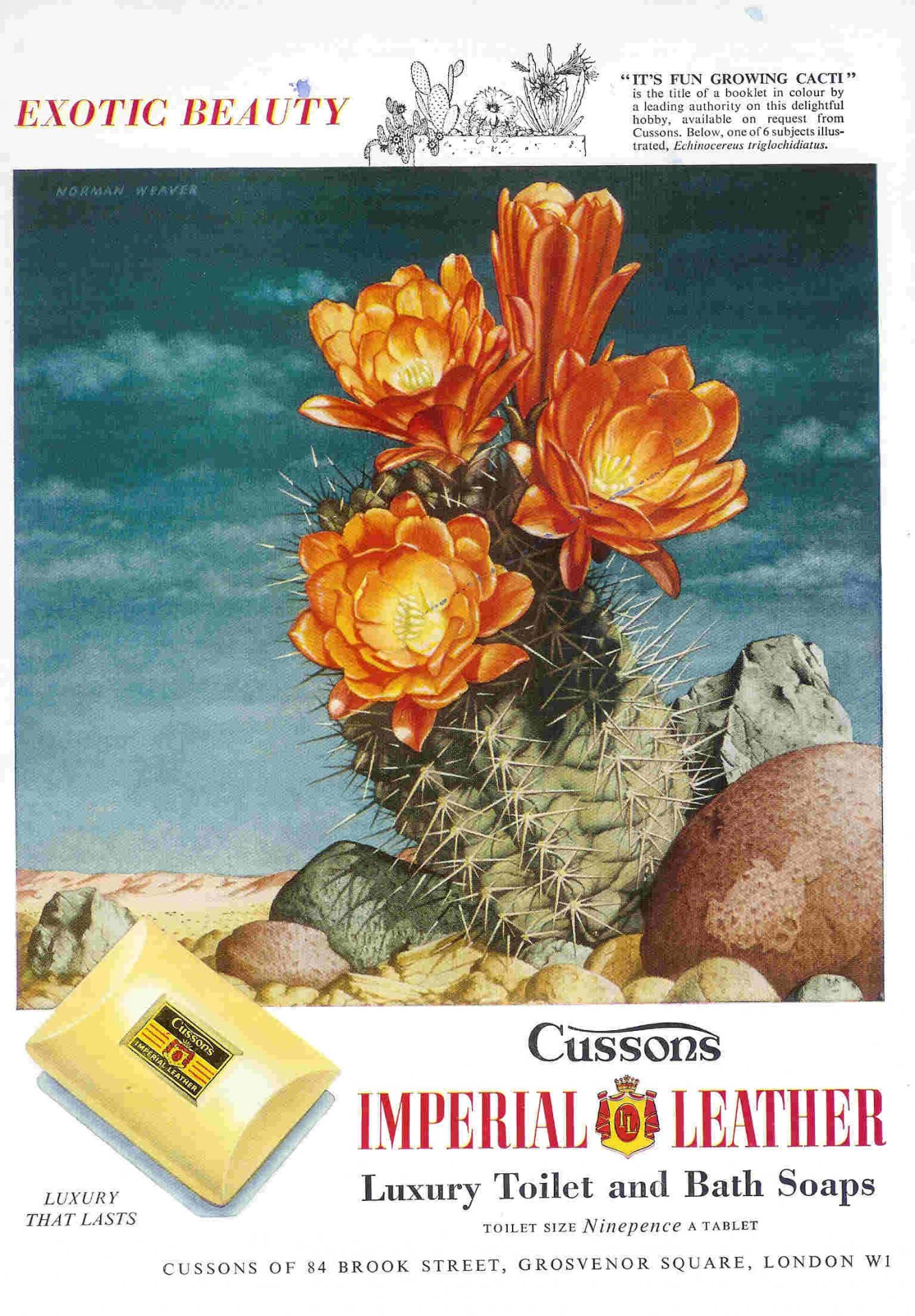
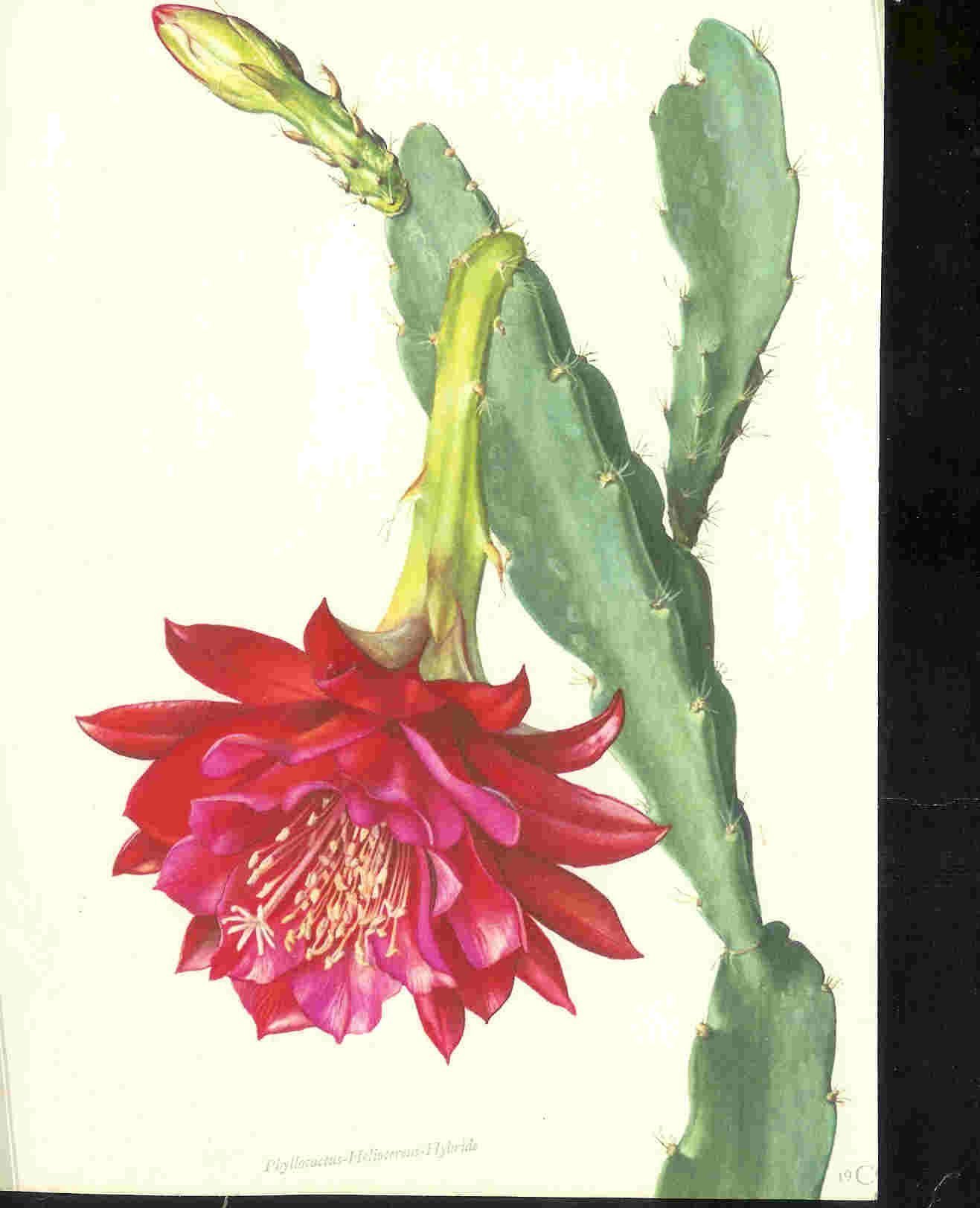
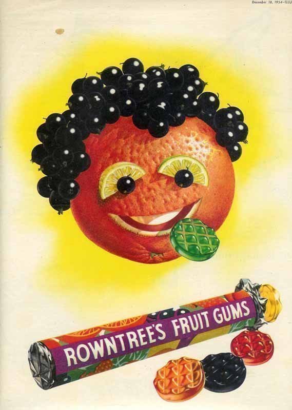
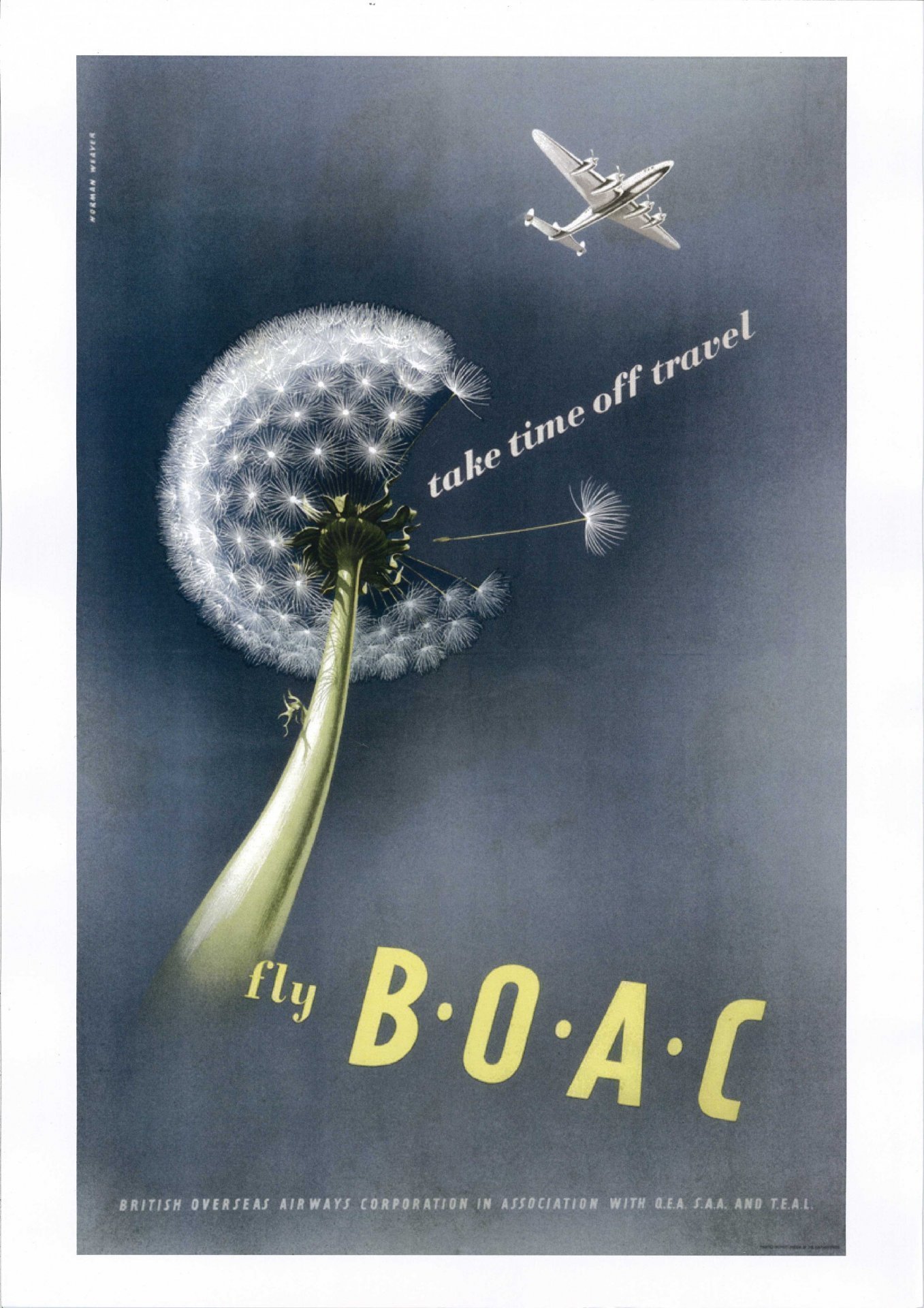
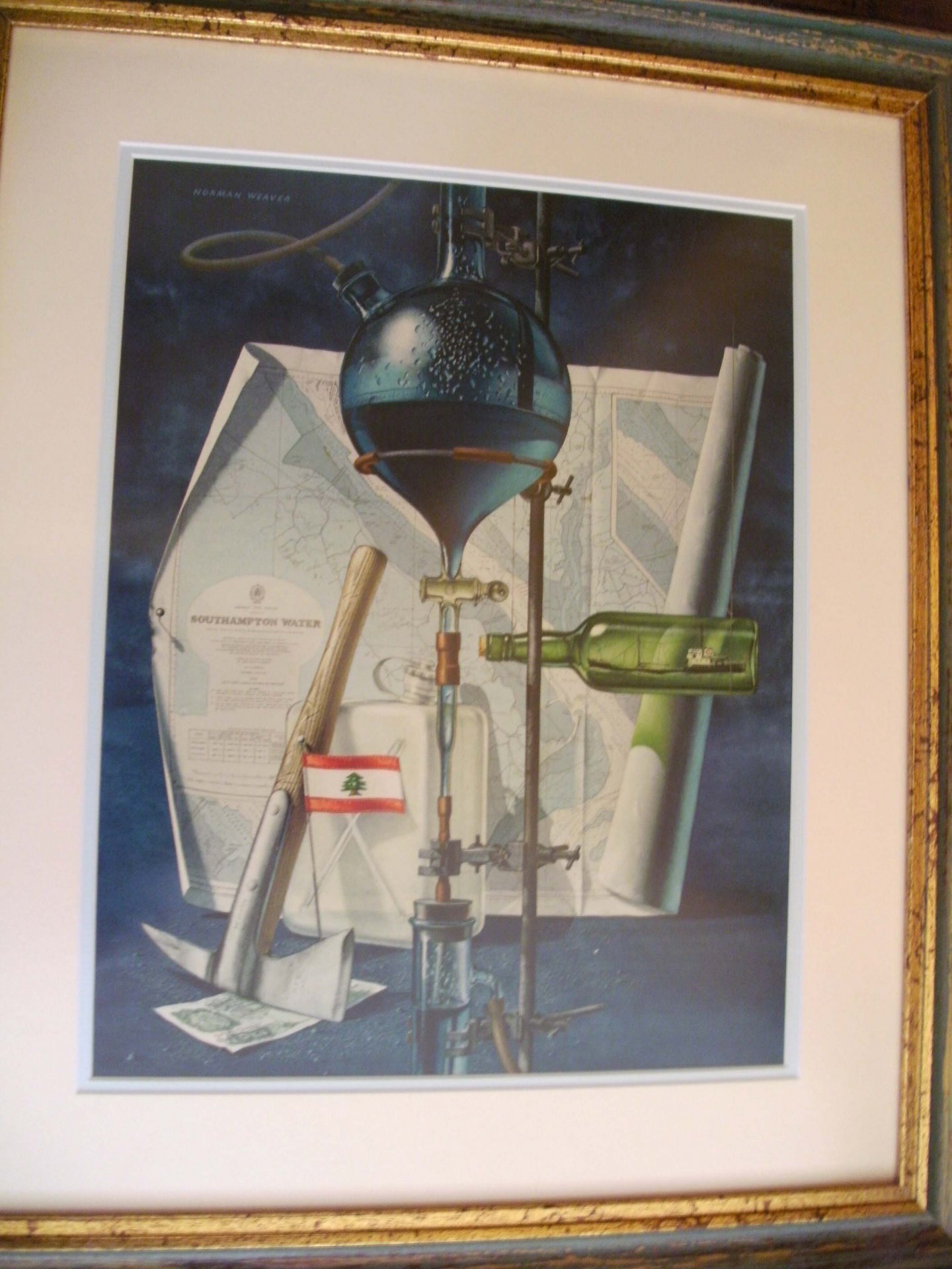
Norman Weaver

Advertising

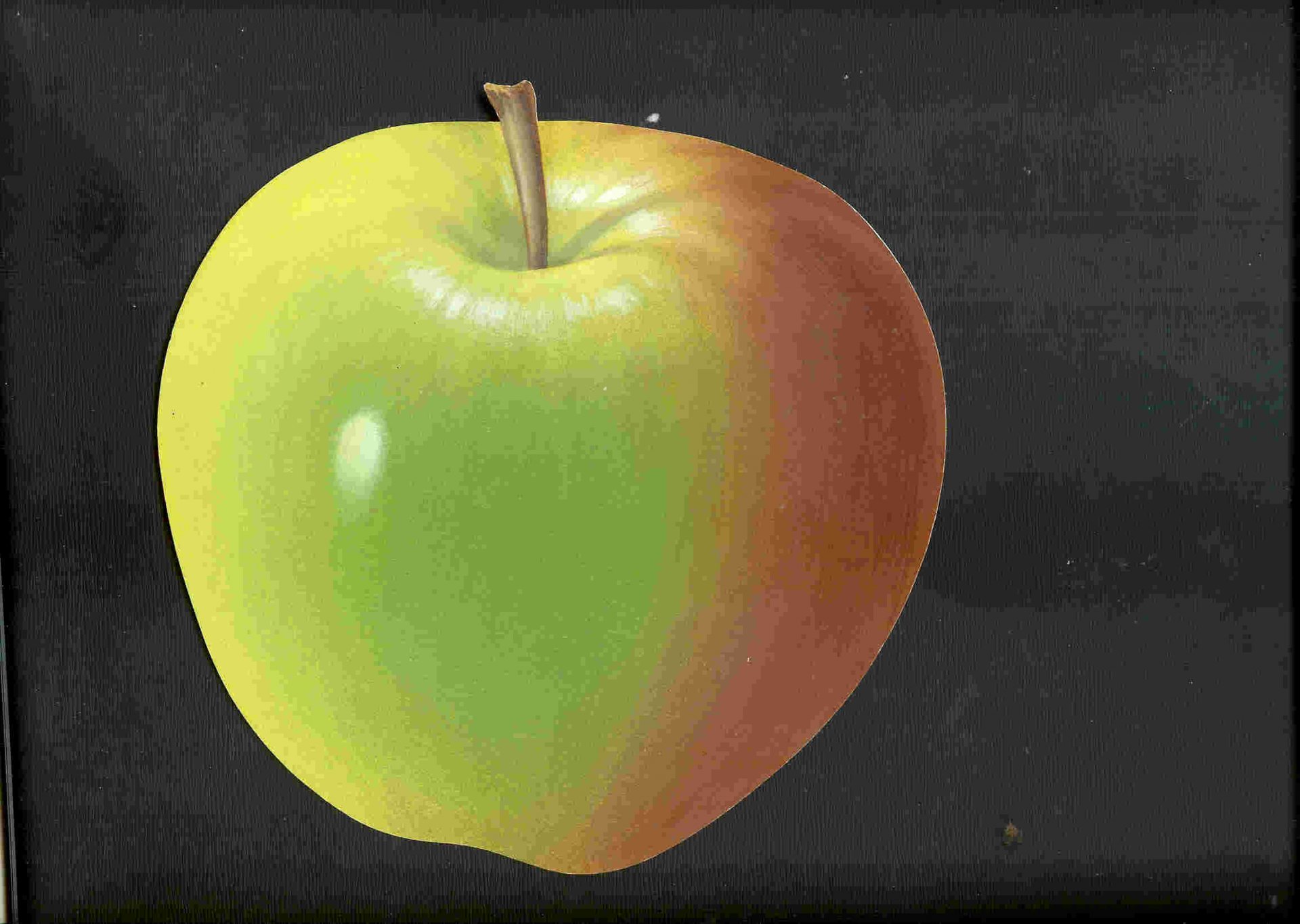
My father used to have to paint from the products themselves, but make them look better / more appetising / more attractive than they perhaps were! These were the days before clever digital photography, and I remember him telling me for example that it was necessary to use orange paint to make milk look like milk - amazing.   All his work is watercolour, and never included the use of white paint - any white areas were the card showing through the other colours.

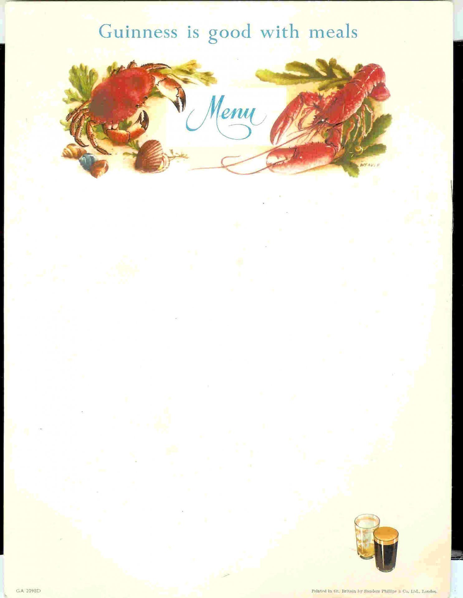
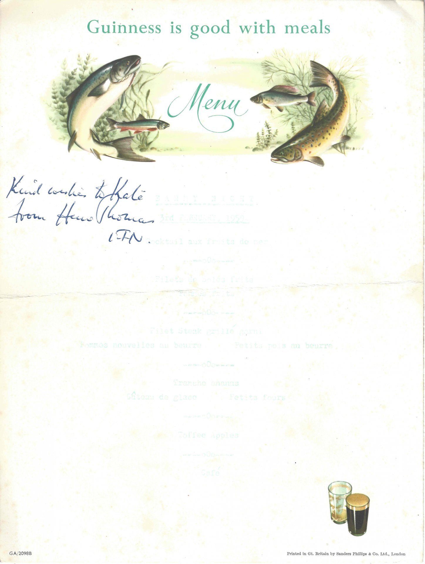
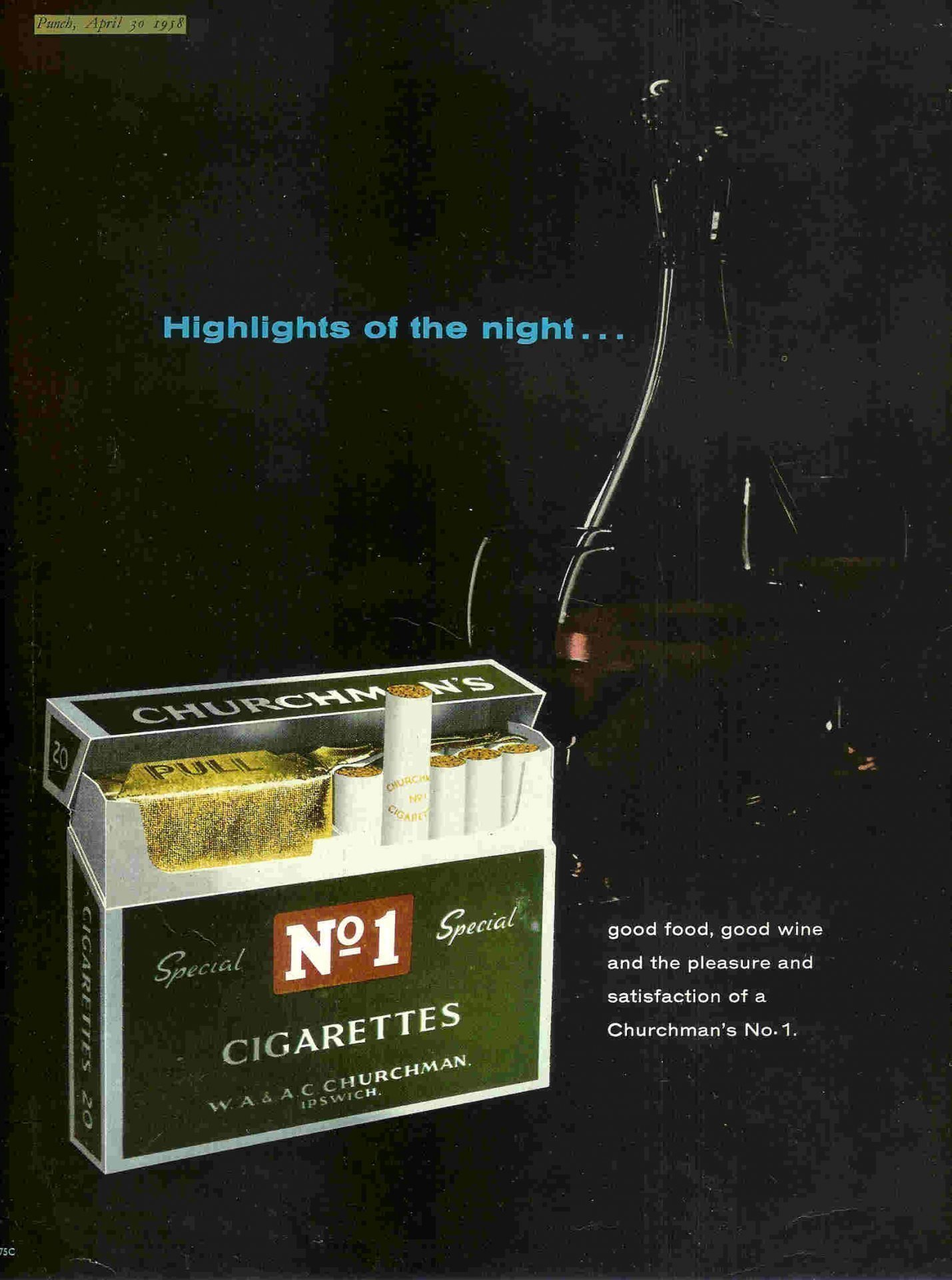
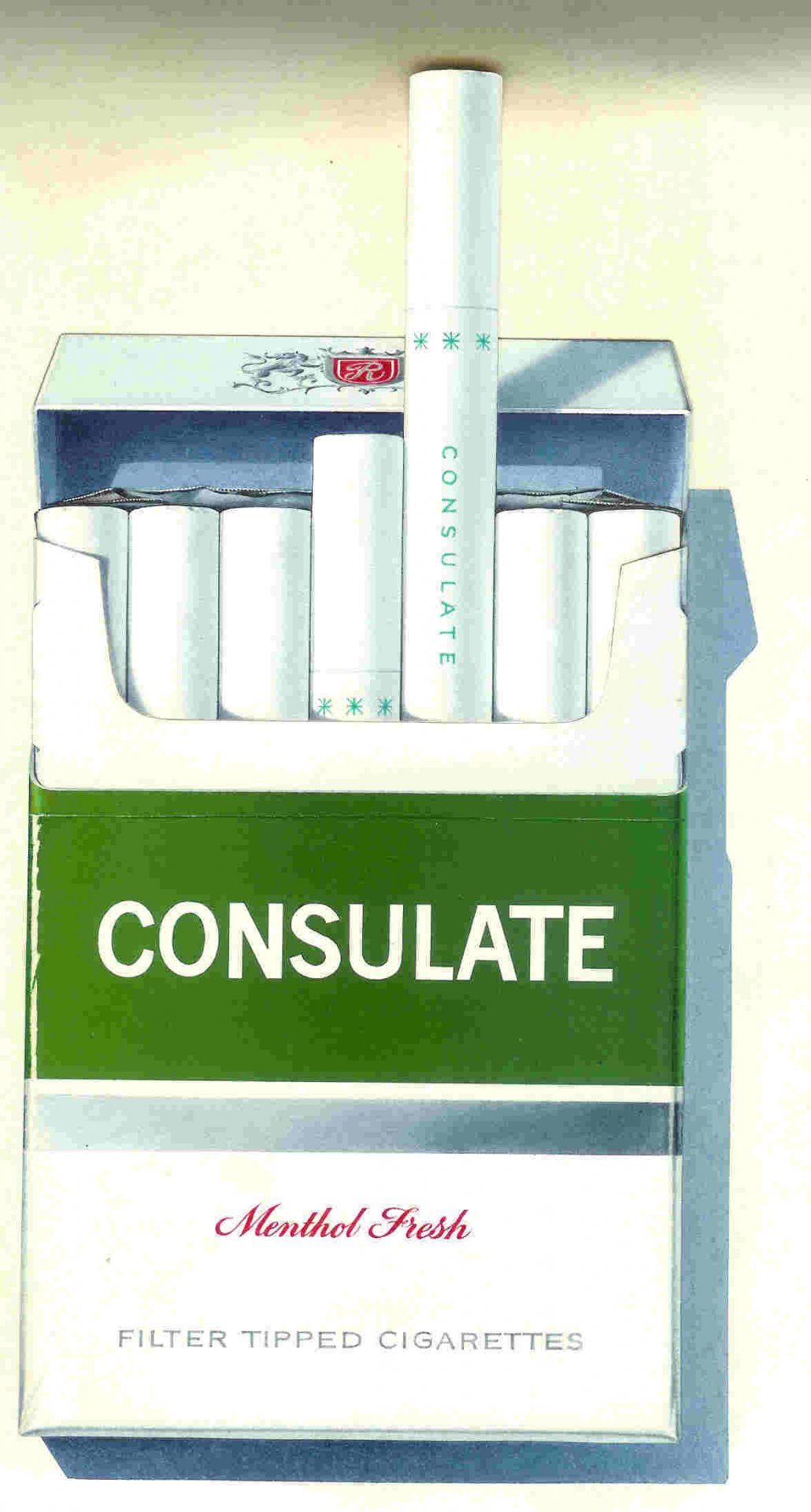
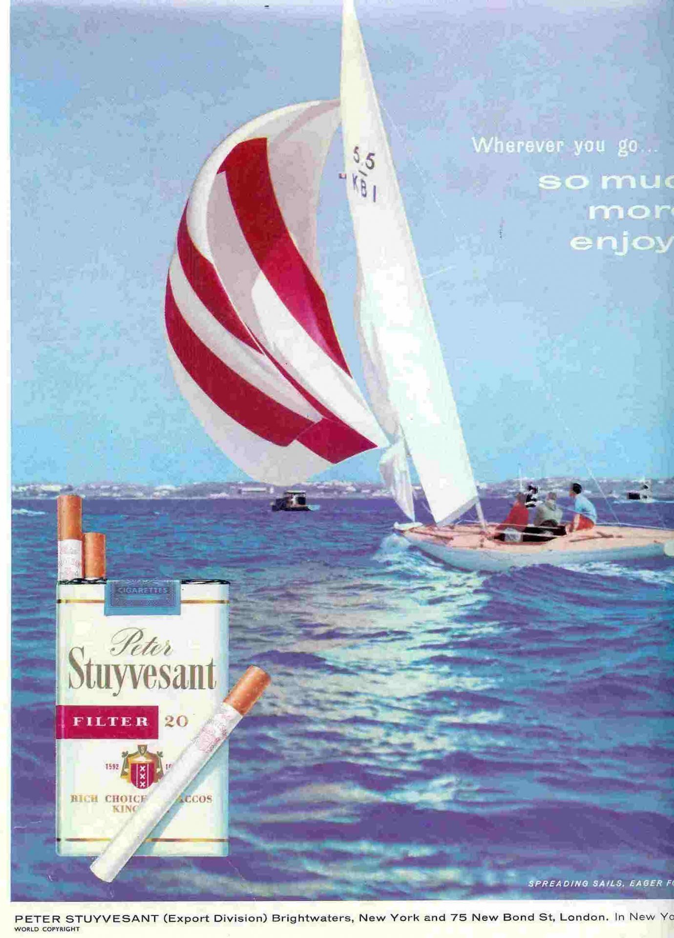
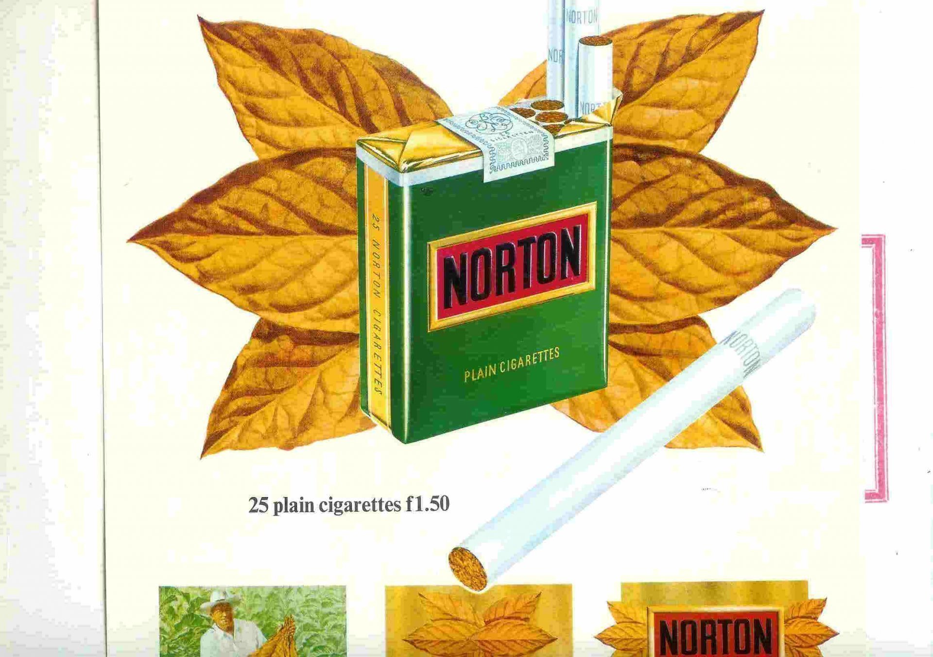
Needless to say, work on products such as chocolate or ice cream was always more popular with my sister and myself than when he was painting cigarette packets or bottles of Guinness!
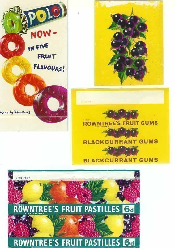
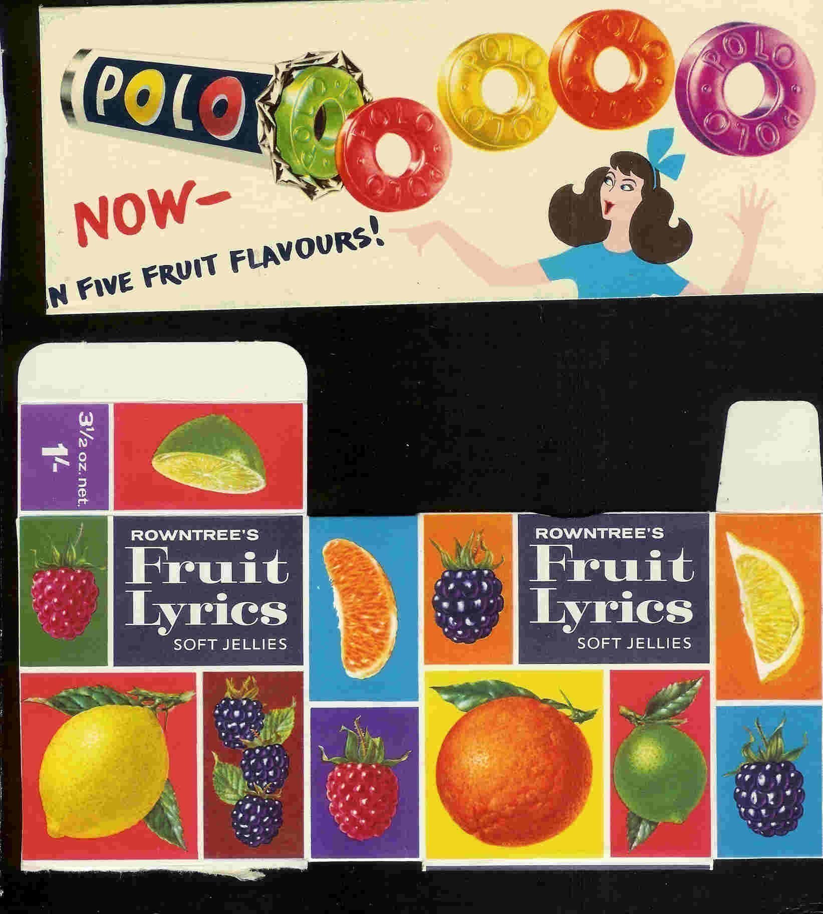
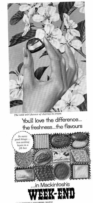
Sweets

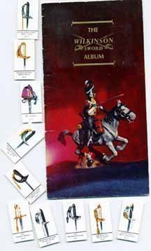
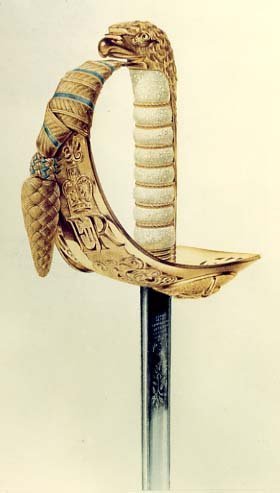
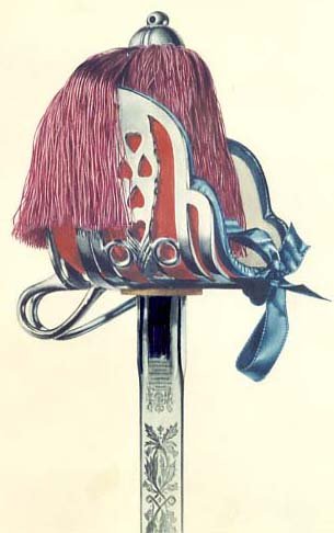
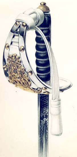
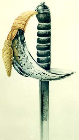
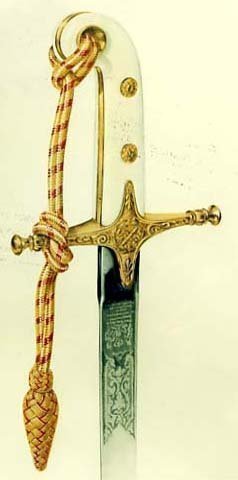
Wilkinson's Sword cigarette cards

I have been particluarly pleased to have found the following artwork, photos of which have kindly been provided by Wilkinson's Sword, who commissioned a set of ten cigarette cards featuring their ceremonial swords.

I remember having these swords in the house for my father to work from, with very strict instructions to my sister and myself to "look - NOT touch!".  Sound advice.  The following photos feature illustrations of swords from the Royal Navy, RAF, Claymore, Lifeguards, Infantry and General Officer:

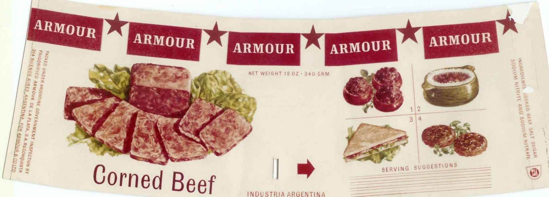
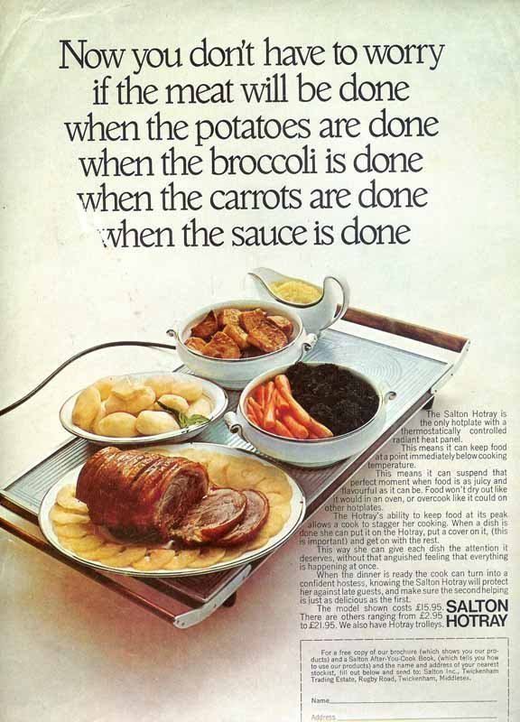
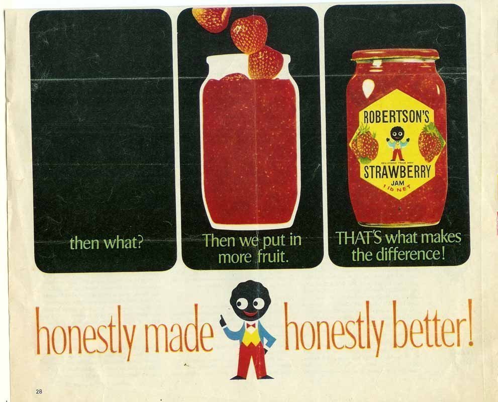
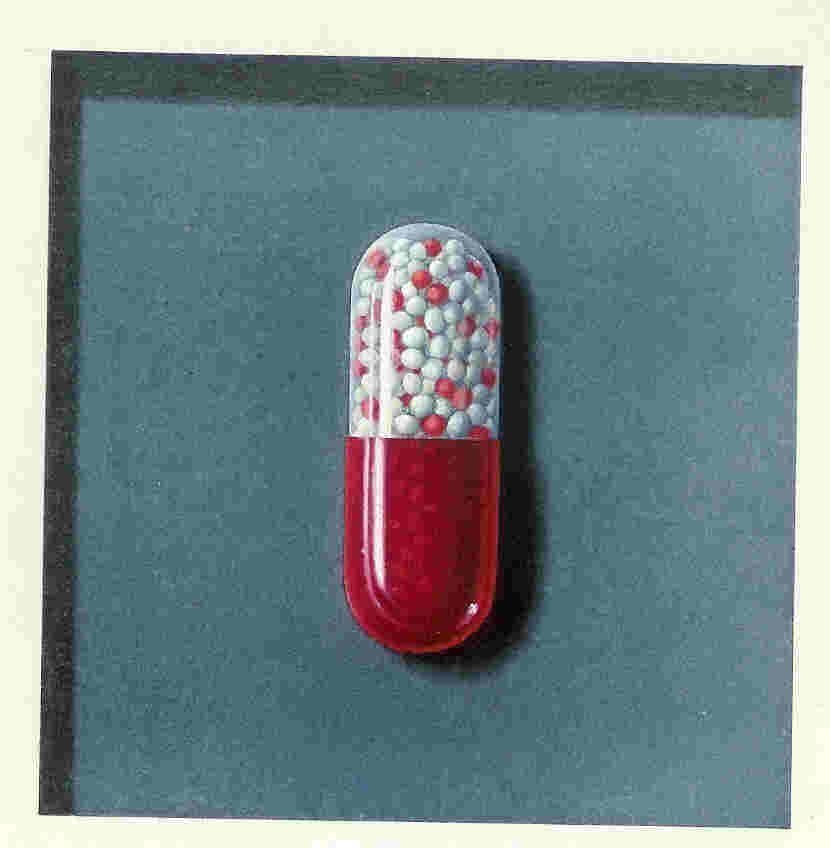
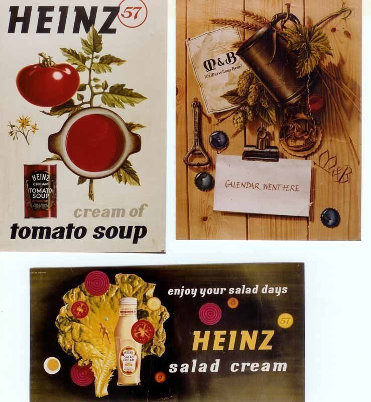
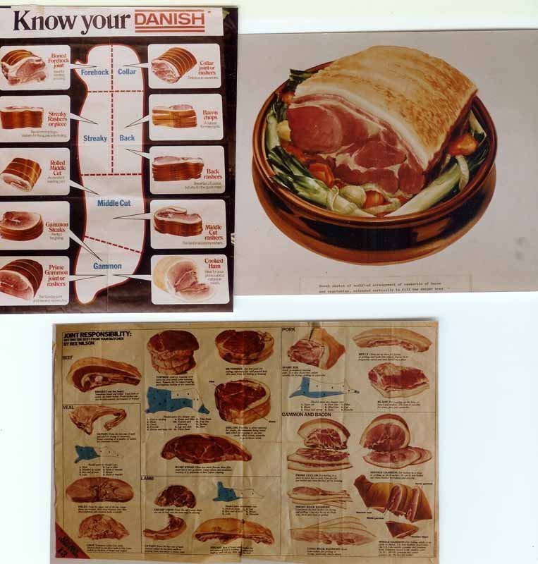
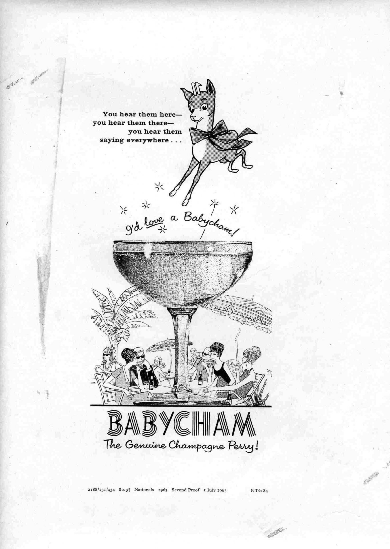
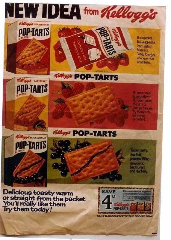
Miscellaneous adverts

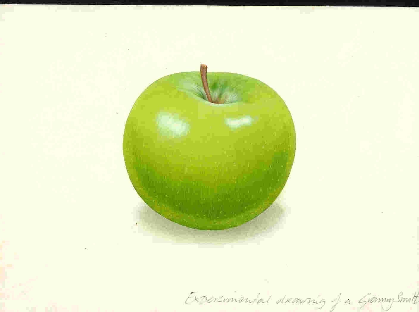
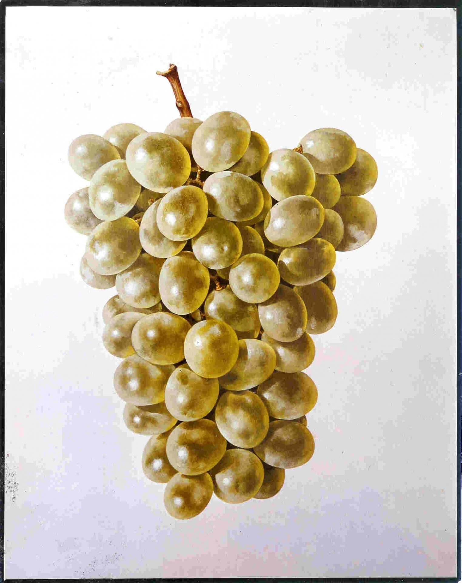
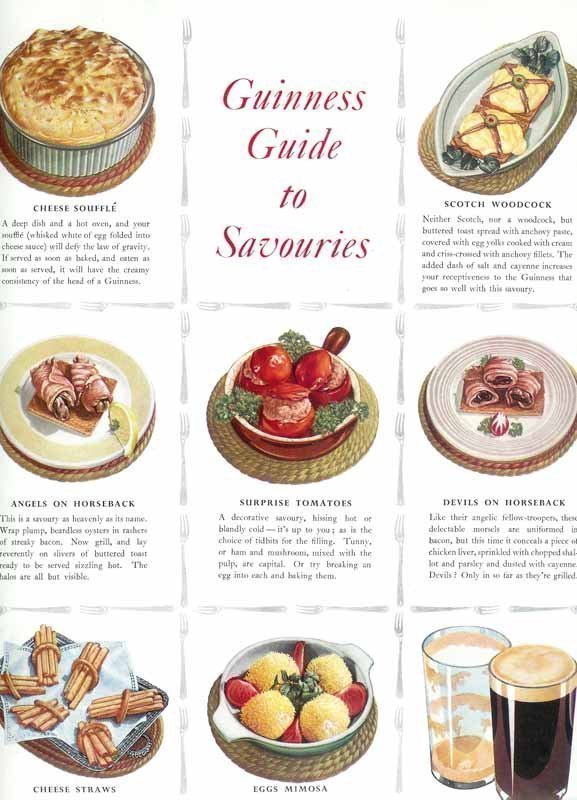
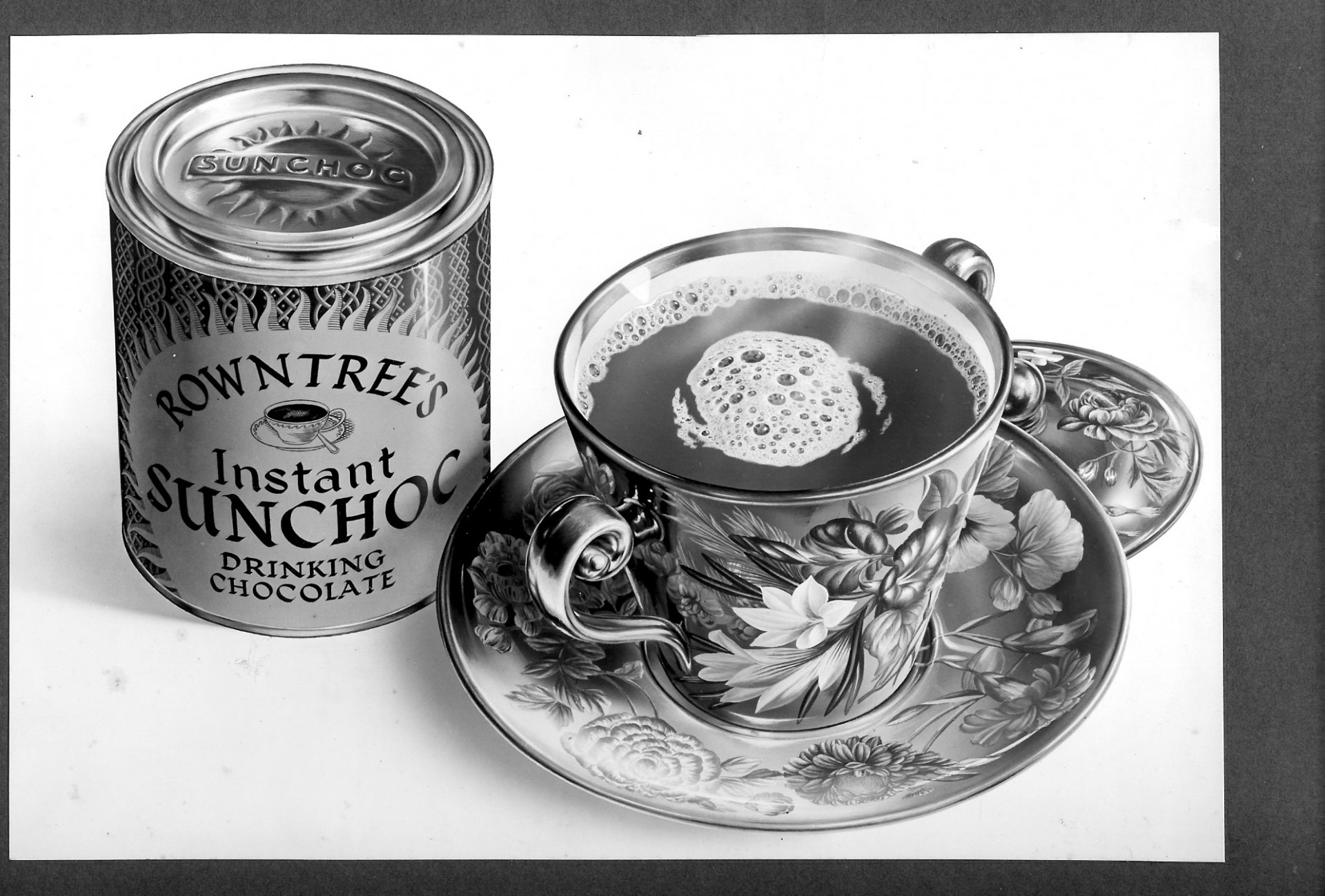
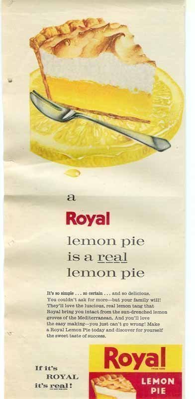
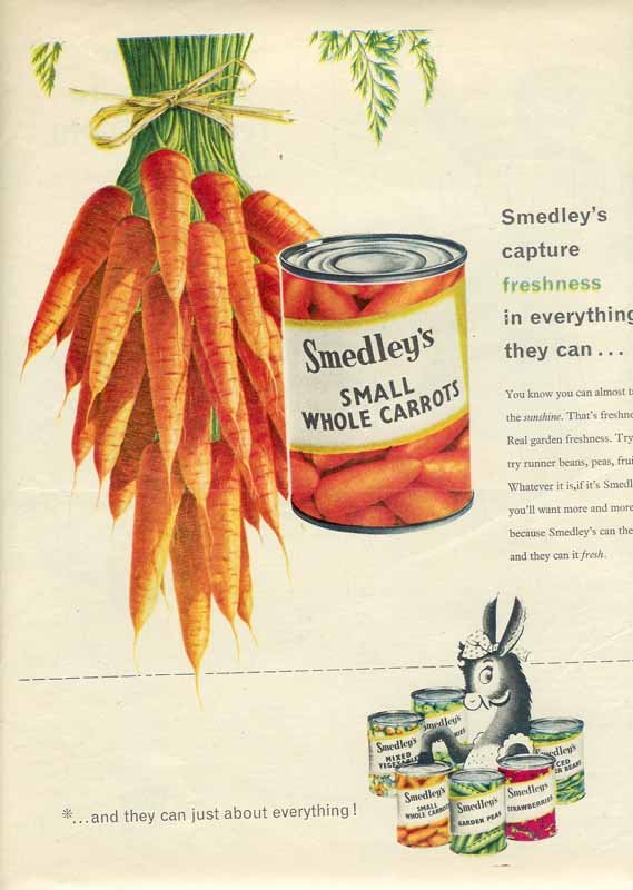
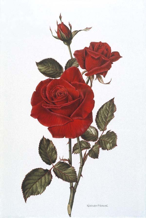
The following pictures are a miscellaneous mix of various bits of advertising work illustrated by my father.  Some of these will be quite familar - others less so.

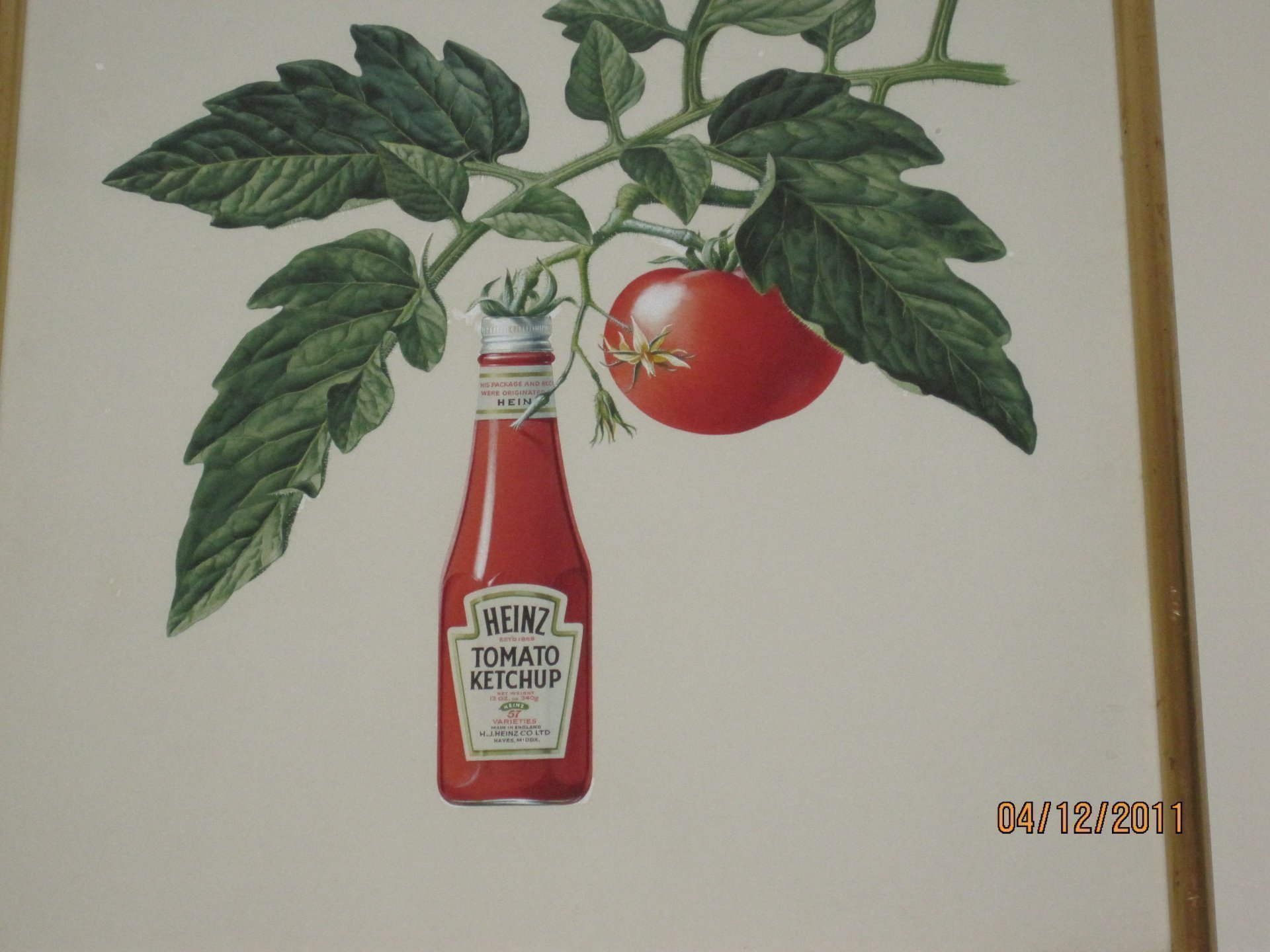
I recently received the following e-mail, together with a scan of the original Heinz artwork, which I had not seen before (see below).  Many thanks George:


Today I was rehanging an original drawing of a HEINZ ketchup bottle hanging from a  magnificent botanical drawing of a tomato  plant.  The drawing appeared in  a magazine ad in 1969.  I was seconded to Heinz UK from the U.S. in that year to be the product manager for HEINZ ketchup.  The framed drawing was presented to me by Young & Rubicam   our ad agency at that time.  I retired from HJ HEINZ CO in Pittsburgh in 1997

I had not noticed the signature "Norman Weaver, 1969" until today.  A quick Google brought me to your email address.   Thank you for all the information about your father, his work and his family.  I am a proud owner of his work.

Kindest regards,  George C Greer 

How times have changed since this type of advertising was allowed! (the note on this says "Punch, April 30th, 1958)
This was the "rough" for the following advertisement:
Then, if our lungs weren't already wrecked, we had these!
I have finally tracked down the Fison's Rose. Dad was very sad that the original artwork for this lovely painting was not returned to him, but I have recently come across a little slide of the painting. If anyone knows the whereabouts of the original, please tell me!
Quite by chance, a "saved search" on eBay recently turned up a postcard of this old poster for BOAC, which I traced back to the British Airways Heritage Centre, who in turn kindly sent me an A3 print:
"Pop Tarts" disappeared for several years, but I remember the original ones, and being sent some samples to try way back in the 60s. They were almost exactly like the ones we buy today... except the prices here were in old money!
I'm not sure how the pineapple slices seem to be permanently attached to the front page of the Esso magazine shown above, but I was recently lucky enough to discover the original Esso artwork being sold at auction. Although the purchase price meant that we couldn't eat for a week, I was delighted to be able to bring home another irreplaceable original, which has now been framed and is hanging proudly on my wall:
My thanks to Young's for finding this label for me. When Dad was first asked to produce advertising artwork, he would sketch out his ideas and submit this as a "rough". Usually some changes and suggestions would be made, and he would get his initial work back with various pencil notes on it for modification. He would then work on the finished painting, which would be submitted to the advertisers for approval, after which, there may be several minor modifications before the painting went to print. In the case of this label, he sketched a basic idea for the ram's head, posted it off.... and the next thing he knew, it appeared on the bottles! He was astounded that this very rough pen and ink drawing could ever have been considered fit for the purpose, and a little miffed that he knew he could have produced something much better. Still, it was used for several years, so someone must have liked it!

Cadbury's

My thanks to Cadburys for finding this picture, which brings back memories of my sister and myself being pressed into service producing daisy chains for Dad to paint.  As fast as we made them, they wilted - so we got pretty good at manufacturing them at speed, and the lawn started to look a little bare whilst Dad was working on this job.

More adverts

I seem to remember that the following paintings of fruit were commissioned by Cape Fruit sometime in the '60s. They were reproduced on card, much larger than life-size, and displayed in greengrocers' shops, hanging from threads suspended from the ceiling.
Still in the greengrocers, but clearly not commissioned by Cape Fruit this time, this painting illustrated different types of English lettuces.
And having eaten our greens, we now move on to the Guinness!
Guiness is good with meals - Kate from Huw Thomas ITN